
Why software is about to stop having an interface
A look at Thesys and Flipbook - what Y Combinator, Anthropic, and the SaaS incumbents are slowly turning into substrates are telling us about who decides what you see next.

I have spent ten years inside the rooms where churn gets engineered on the UI and product level.
Sitting next to the heads of product who green-lit five-step cancellation flows because the data said each step saved seven figures a year, sitting through QBRs where a 0.3% lift in conversion from a darker shade of red on the upgrade button was treated like a strategic victory, listening to retention specialists explain why the default-on auto-renewal toggle was actually pro-consumer if you squinted at it the right way.
The entire D2C and SaaS economy of the last 15 years rests on decisions like these. Most of them are not malicious, of course, and made by smart, well-intentioned people inside companies whose growth model requires that users not be too easy to lose. There are many examples out there on websites like Deceptive.Design and Confirmshaming - you’ll actually be surprised to see companies whose services you use every day.
But something has been shifting underneath this whole structure for a while now as users stopped tolerating dark patterns. They started recognizing the cancellation maze, the default-on toggle, the artificial scarcity timer, the "are you sure you want to leave us?" spiel, and they learned to screenshot it and post it. They learned that the friction was a tell - a sign that the product knew, on some level, that it could not retain them on value alone. I wrote about this in The Retention Wall Is Dead issue: the entire architecture of friction-based retention has been losing legitimacy after the loud FTC case that happened with Amazon.
And underneath that legitimacy crisis, a second thing has been happening - a thing that is harder to see from inside a company because it does not show up in dashboards. User expectations have grown faster than any single interface can keep up with.
The people using your product in 2026 are using ten other products in parallel, all of them iterating weekly, all of them reshaping what “good” feels like.
> The support agent using Zendesk is also using a custom Notion dashboard their team configured in two hours.
> The marketer using HubSpot is also asking ChatGPT to draft their entire campaign brief in chat.
Every one of those parallel experiences resets the user’s sense of what their interface should feel like - and the gap between what their primary SaaS can show them and what their workflow actually requires has gotten wider every quarter for five years. No static UI is capable of reflecting 100% of how a real user actually works. The shape of work is now too specific, too cross-product, too personal. The interface that the vendor designed three years ago for an idealized user who does not exist is not going to catch up.
Both of these pressures - the legitimacy collapse of friction-based retention, and the impossibility of designing one screen that fits a real user’s actual workflow - point to the same conclusion: something has to replace the static, vendor-controlled interface. The question that has been live in product circles for the last two years is what.
There have been two main guesses, and they are very different from each other. The first guess is that the interface gets replaced by voice. This is the death-of-the-UI thesis - that the next paradigm of computing is intent-first, that users describe what they want and a voice agent does it, and that the screen becomes a vestigial layer or disappears entirely.
Voice Control?
It is an aesthetically clean idea. It is also, on closer inspection, almost certainly wrong as a primary modality. Voice input is fast, but voice output is slow - the user has to listen to the response in real time, in serial, with no ability to scan or skim. A 200-word answer takes 90 seconds to listen to and 12 seconds to read. Multiply that across every interaction in a workday, and voice becomes punishing for any task more complex than setting a timer. Voice will absolutely have a role for ambient computing, hands-free contexts, and accessibility - but it is not going to be the primary way most knowledge workers interact with their software, because nobody has the patience.

Picture courtesy of Jakob Nielsen

The second guess is that the interface becomes fluid - composed on the fly, per user, per query, per session, by an agent that knows what the user is trying to do and what the underlying software can do.
Dynamic interface thesis
Two signals that are currently setting the fashion here:
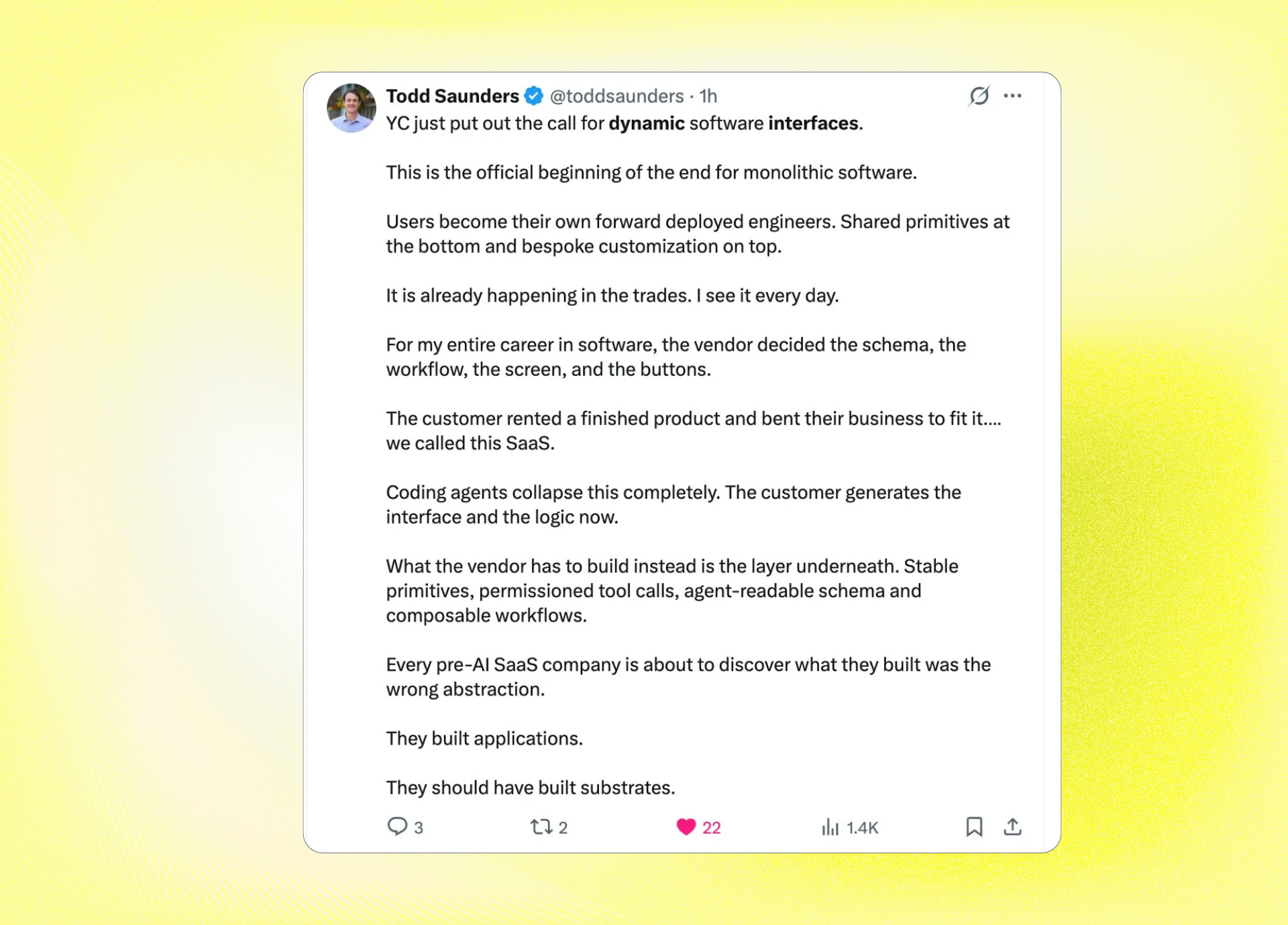
Y Combinator put Dynamic Software Interfaces on its Spring 2026 Request for Startups and named it as a category.
MIT Technology Review put generative coding on its 10 Breakthrough Technologies list for 2026, which is the supply-side enabler - the moment users (or their agents) can compose software faster than vendors can ship it, the lopsidedness of who-controls-the-screen has to break.
The institutional consensus formed quickly, faster than any tech-trend consensus I have seen since mobile-first. Within six months of the YC RFS, every major SaaS vendor had made some public gesture toward primitives, agent readiness, or MCP integration.
So far, so unanimous. And here is where I have to stop nodding along, because almost everybody discussing this shift is discussing only half of what it actually is.
The story being told right now about dynamic interfaces is about freedom - users finally getting software that fits their workflow instead of bending around it. That story is half the picture. The other half is that an entire generation of retention machinery is about to stop firing, and most of the people who built that machinery are pretending not to notice.
I have been thinking about this shift for two years, since the moment it became obvious that the speed at which someone could vibe-code a working app had collapsed below the speed at which an incumbent SaaS team could run an A/B test on a paywall variant.
Dynamic interfaces don’t just change how products look. They expose which products were retention-by-design and which were retention-by-manipulation.
Two cycles are running at the same time, pulling in opposite directions. They describe the same shift, but they produce opposite consequences.
The Authorship Cycle is what everyone talks about. AI gets good enough to compose interfaces from primitives, vendors ship those primitives instead of finished screens, users (or their agents) reshape the product into the form they actually need, and the long tail of niche workflows finally gets served.
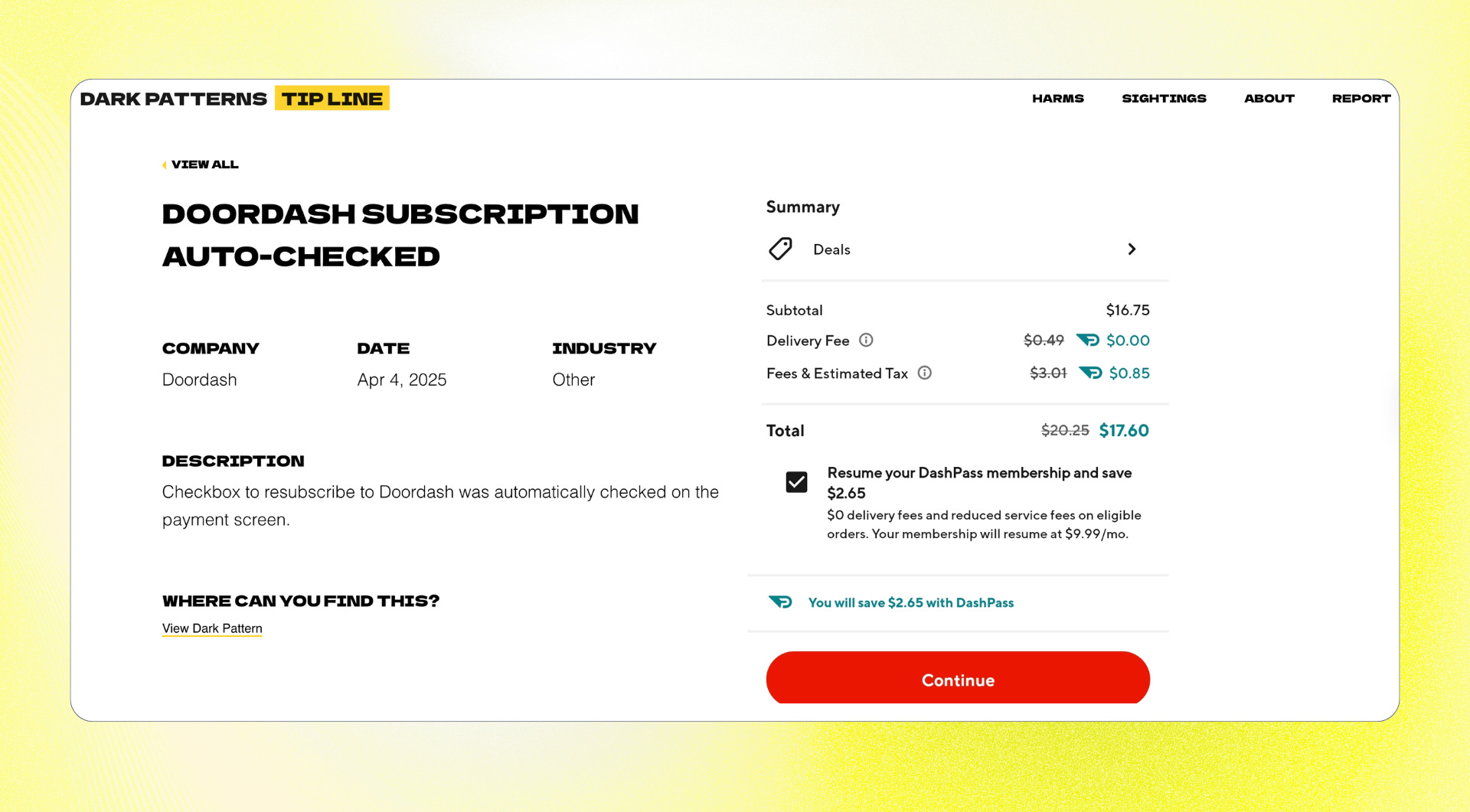
The Trap Cycle runs underneath the same shift in the opposite direction. When the interface composes itself per session, the upgrade banner doesn’t render. The cancellation flow has nowhere to put its five “are you sure?” steps. The pre-checked subscription box never appears in the form because the agent didn’t think to ask for it. The cross-sell sidebar doesn’t exist because the user didn’t request a sidebar. The streak counter, the unread badge, the activity feed driven by in-app state, the “you have 3 unread items” notification, the weekly recap email triggered by engagement metrics that only mean something inside the vendor’s UI - all of these are interface manipulations that depend on the vendor controlling the screen, and they stop firing the moment the vendor stops controlling it.
The thing that has been quietly disturbing to watch is how few of the incumbent SaaS companies are willing to talk about this honestly. Look at the launch partners listed in the Anthropic MCP Apps press release - Salesforce, Asana, Slack, Box, Canva, Figma, Hex, monday.com. Every one of them signed up. Not a single one has publicly addressed what it actually means for their growth model when a user’s agent composes the interface inside Claude rather than inside their app. That silence is not a coincidence. Signing up was defensive - the alternative, being absent from the launch slide while every competitor was on it, would have been worse. But every interface surface they let Claude render is a surface where their own retention machinery does not fire. They are renting out their data to a chat window with the UI traps removed. The internal numbers will eventually make this visible. The public conversation has not caught up yet.
The dynamic interface era is not a UX trend. It is an audit of which SaaS businesses had real product value and which ones were getting away with it.
Here is the test I keep running in my head, on every product I have observed up close, every product I see in the market, every product I am asked to evaluate. If the user’s agent rendered your product into the exact view that user needed - no upsell modal, no cancellation friction, no cross-sell, no streak counter, no notification dot, no default-on toggle, no “are you sure you want to leave?” - would your retention numbers hold?
For most products I have watched up close, the honest answer is no. The companies were not retaining users. They were retaining the conditions under which users couldn’t leave. The dynamic interface era takes those conditions away.
It means a reckoning is coming, and most of the companies it is coming for cannot see it from where they are standing.
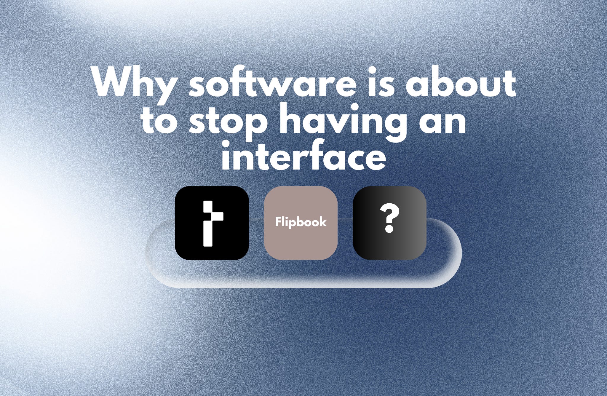
THESYS
Thesys was started by Rabi Shanker Guha and Parikshit Deshmukh - two engineers who came out of Google, Stripe, and Salesforce having watched dozens of enterprise AI deployments stall on the same boring problem. The model worked, the data was clean, the agent did what it was supposed to do, but every customer wanted a different interface and nobody could afford to build them all by hand. Guha and Deshmukh quit and built the missing layer themselves. Today Thesys sells an API called C1 that turns LLM responses into live, streaming, interactive UI components - forms, charts, dashboards, tables — composed in real time inside someone else's product. The customer is a SaaS company building an AI agent that needs a different interface for every possible query state. C1 is the layer that makes those interfaces appear without anyone hand-coding them. The whole company is optimized for what I'd call infrastructure-grade UI generation.
Primary intent: Vendor adaptation.
Job it does:
“My AI agent has infinite output states. I cannot pre-design a screen for every query my users will ask. I want a layer that generates UI from the agent’s response, in production, matching my brand.”
It translates to:
Developer integrates C1 in two lines of code
User queries the AI agent inside the SaaS product
C1 streams structured UI components into the React frontend per query
User interacts; actions feed back to the agent
Next query produces an entirely new composition.
Best users:
Engineering teams building AI copilots inside existing SaaS
AI-native startups whose product is the chat interface
Internal tools teams replacing six static dashboards with one dynamic surface
Vertical AI agents in legal, medical, or financial domains
Churn watch: Thesys becomes infrastructure debt the moment a customer ships it to production, which is its strength and its trap. The strength is real, though - ripping it out means rebuilding the entire UI layer, which nobody wants to do. The trap is that the same primitive is being standardized at the model-provider level, for free, by Thesys’ biggest suppliers. Anthropic shipped MCP Apps in January with the same capability. OpenAI shipped Apps SDK in October. Vercel open-sourced json-render in January and it accumulated 13,000 GitHub stars in three months. That conversation is coming inside twelve months, and Thesys’ best defense is to become so design-system-aware, so brand-protective, so embedded in customer workflows that it earns its keep on top of the commoditized layer beneath it.
FLIPBOOK
Flipbook was built by Zain Shah - a former OpenAI researcher who’d worked on AI and robotics, then spent time at Samsung as a Creative Technology Expert - together with Eddie Jiao and Drew Carr. Shah is a YC S13 alum, which means he has been around the cycle once before and chose to come back in 2026 with a thesis: that the next paradigm of computing is not better software but a different rendering layer entirely, one where pixels come straight from a model rather than from a layout engine interpreting HTML. They launched Flipbook in April 2026, and the founder's thread went viral within forty-eight hours.
The product they shipped is optimized for what I’d call interface-as-medium, and it does its job in the most maximalist possible way. There is no HTML. There is no layout engine. There is no DOM. Every page is a full-screen image generated live by a model, streamed via WebSocket from a serverless GPU running an optimized video diffusion model. You click anywhere on the image, and a new image generates that dives deeper into that part of the previous one. The page is the medium, and this medium is alive. There is nothing else.
Primary intent: Visual exploration.
Job it does:
“I’m curious about something and I do not want to read a wall of text or click through ten Wikipedia tabs. I want the medium itself to feel shaped to my curiosity.”
It translates to:
User types a topic or uploads an image
Flipbook generates a full-page illustration in real time
User clicks any region of the image
A new image generates that goes deeper into that region
Navigation history saves as a tree of generated nodes
Exploration continues until the user closes the tab.
Best users:
Visual learners who hate reading
Designers and product thinkers looking at the future of the web
Curious consumers who fall down rabbit holes for fun
Educators experimenting with media as pedagogy
Churn watch: Flipbook has no functional job-to-be-done. The novelty wears off in three sessions. It cannot replace search (slower, less accurate, no citations). It cannot replace Wikipedia (you cannot quote a generated image, you cannot trust it on facts). It cannot replace YouTube (the video is hallucinated, not real). The team has said publicly that the product is limited by design and that the set of useful applications will expand as the models get more accurate and stateful. That is a confession, not a roadmap - it concedes that today’s retention depends on the user accepting a demo, not a product. Flipbook is the most intellectually honest thing in the entire dynamic interface conversation, because it commits to the maximalist version of the thesis (the page itself should die) without pretending to have figured out what people will actually do with it.
[VACANT]
This is the slot that does not have a product yet. It is the slot Y Combinator’s RFS is pointing at. It is the slot Rhys Sullivan’s prototype gestures toward, the slot Peter Steinberger’s openclaw canvas hints at on a Friday night demo. And it is the most valuable empty seat in software in 2026.
The product that fills this slot does one thing: it lets a user’s agent reshape an existing SaaS into the form that user actually needs, while the vendor keeps the data, the integrations, the auth, and the billing. The user does not build a new app. The user modifies someone else’s app in place. Salesforce, but only the seven fields the salesperson actually uses. Notion, but with the structure your team’s coding agent thinks makes sense for your workflow. Zendesk, but with the ticket interface generated per support agent based on their case mix and tenure. Linear, but with the project view restructured around how your specific team thinks about scope.
Primary intent: Substrate extension.
Job it would do:
“I use this SaaS every day. Sixty percent of the interface is irrelevant to my workflow, and I have spent two years building elaborate workarounds to ignore the parts I don’t need. I want my agent to rebuild the parts I actually use, in the shape I actually need, while keeping everything underneath that I depend on.”
Six retention mechanics in a world where the vendor doesn’t pick the screen
If you are a PM, founder, or Marketer watching this shift unfold, here is what to actually do about it. Not next year, not when your CRO finally takes the threat seriously, but now.
1. Invest in the substrate, not the surface.
Stop treating your UI as the moat. The moat is your data model, your integrations, your permission system, your API speed, the accuracy of your search index - the parts of your product that survive even if a user’s agent renders the entire interface from scratch. Reallocate engineering hours away from polish on screens that may not exist in two years and toward making the underlying capability genuinely best-in-class. The question to ask in every roadmap review is no longer “will this look good in the demo?” but “would a user’s agent still pull from us if it could pull from anyone?” If the answer to the second question is no, your roadmap is wrong.
2. Run the trap audit before the market runs it for you.
Take every UI surface in your product right now and sort it into two columns: surfaces that serve the user, and surfaces that serve the business at the user’s expense. Be honest. The cancellation flow with five “are you sure?” steps goes in column two. The pre-checked email subscription box goes in column two. The “upgrade to Pro” banner that fires on the seventh page view goes in column two. Then look at how much of your retention math depends on the column-two surfaces. That number is your exposure. Every dollar of retention that comes from column two is a dollar that disappears the moment the user’s agent starts composing the screen. Plan for the day that revenue line goes to zero, because it is going to.
3. Rebuild your cancellation flow before regulators or your users force you to.
The legal cover for dark-pattern cancellation is collapsing - the FTC went after Amazon Prime, the EU passed the Digital Services Act, and a generative interface that lets users (or their agents) skip your friction layer entirely makes your “are you sure?” flow look indefensible. Get ahead of it. Make cancellation a one-click action. Replace the friction with a genuine why are you leaving survey that you actually use to fix the product. You will lose some short-term saves. You will gain something more durable: a churn number that reflects reality, which is the only kind of churn number you can actually fix.
4. Redesign engagement to be requested, not injected.
Streak counters, notification dots, unread badges, activity feeds, in-app state-driven recap emails — these survive only as long as you control the screen, and you are about to stop controlling the screen. Start building engagement loops the user can opt into and configure. Let them choose which signals they want pushed to them and where. Build the version of your product that still works when the user has filtered out everything you wish they wouldn’t filter out. The Duolingo-Snapchat-Slack engagement model is on a clock; the products that move first to user-requested engagement will define what the new model looks like.
5. Treat cross-sell and discovery as products, not placements.
Stop relying on the sidebar, the “customers also bought” rail, the homepage promo slot. They will not exist in two years for the segment of your users whose agents compose the interface. Build discovery as a feature the user actively wants to use - a recommendation surface they open intentionally, an exploration mode they trigger, a question they ask their agent that pulls from your catalog. The companies that make discovery feel useful rather than inserted will extract real expansion revenue from the new era. The ones still relying on placement will watch attach rates fall by half with no clear path to rebuild what they had.
6. Make your substrate carry the brand the screen used to carry.
When the user’s agent decides what the interface looks like, your brand stops being carried by the visual layer. It gets carried by the data quality, the trustworthiness of the API, the speed of the response, the ethics of how you handle customer information, the way support handles a tough ticket. Audit each of these the way your design team audits visual consistency - because they are now doing the work the visual layer used to do. The substrate is the brand now. Make sure yours is one a user’s agent would choose.