ADHD mainstream got focus apps split into three paths
Apps stopped selling "better blockers" and started selling "when do you need help?" - before distraction, during work, or when willpower fails.

You probably have something on your phone right now that stops you from opening Instagram mid-task, or plays ambient sound that helps you concentrate, or shows you exactly how distracted you were yesterday. Hard to imagine we ever worked without that kind of environmental support. Today, it’s even harder to imagine trying to write, code, or think deeply without architecture that protects attention before the phone even lights up.
That wasn’t always the case.
In the 2000s, distraction was asynchronous -- email piled up in your inbox, instant messages waited for replies, but nothing grabbed your attention in the moment. You could walk away from the computer. Focus was a question of discipline, not design. The fight was internal: you versus your own impulse to check.
Later on, smartphones arrived. Push notifications normalised interruption. By 2018, the average person received 150 notifications per day and unlocked their phone 85 times daily. Responsibility for focus shifted from self-control to environmental management. Distraction became ambient, architectural, continuous. The device sat in your pocket, radiating possibility and provoking curiosity.
The velocity increased. Social media feeds replaced chronological timelines with algorithmic ones optimised for engagement, not closure. Infinite scroll became standard. TikTok shortened videos to under 15 seconds. By 2025, the average adult spend over 7 hours daily on screens. Attention spans stabilised at 40-47 seconds, and instead of fighting it, people accepted it as the new normal.
The real shift happened with the recognition that willpower had structurally failed.
For decades, focus tools evolved -- from simple timers to website blockers to gamified productivity. On the surface, this looks like a feature upgrade.
In reality, it reflects something more structural:
The collapse of sustained attention as the default state.
Market at a glance:
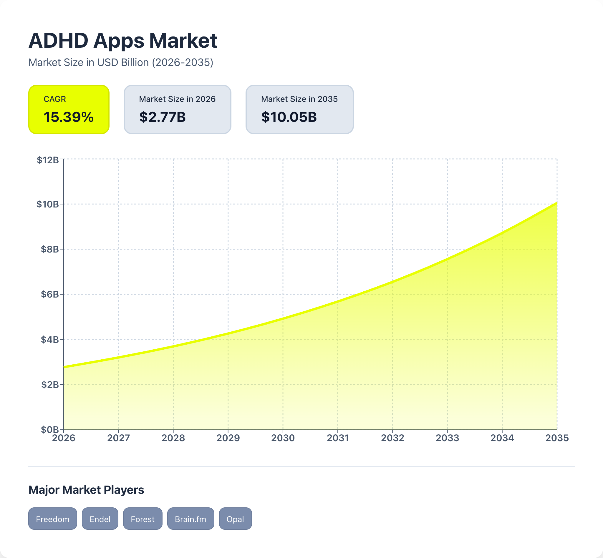
The ADHD and focus app market is scaling rapidly -- from $2.08B in 2024 to ~$7.7B by 2033, growing at a ~15% CAGR, driven by rising ADHD diagnoses (3-5% annual increase), remote work fragmentation, attention crisis among young adults (82% report concentration difficulties with social media), and smartphone ubiquity (5+ hours daily use). The broader gravity includes digital wellness, mental health apps, and workplace productivity tools, making this a structurally expanding category rather than a niche productivity hack.
User base: 11M+ Americans use ADHD apps regularly; 59% of adults use them specifically for work productivity.
Key market drivers:
- Rising ADHD prevalence: 3-5% annual diagnosis increase, adult recognition growing
- Attention crisis: 82% of young adults report concentration difficulties with social media
- Remote work: 46% of adults with ADHD use apps for work tasks, no physical boundaries
Focus apps replaced distraction, then temptation, and now they’re replacing the cognitive architecture that made deep work possible.
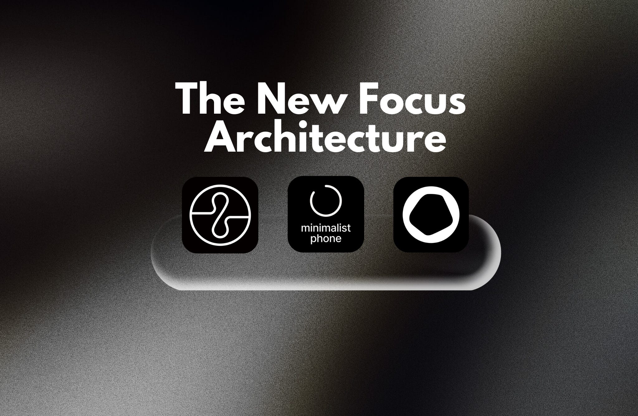
Endel, Minimalist Phone, and Opal are not variations of the same product. They are answers to different breakdowns in today’s attention.

Endel is optimised for what I’d call ambient cognitive support and does its job extremely well.
Primary intent: Environmental optimisation
Job it does:
“My environment is too chaotic to focus. I need something that creates a focus-conducive atmosphere without me having to think about it -- something that just works in the background while I’m trying to work.”
It translates to: Sense environment ✔️ > Generate adaptive soundscape ✔️ > Modulate in real-time ✔️ > Sustain over extended sessions ✔️
Optimised for: • Ambient focus support during work sessions • Passive integration into daily routines (runs like Spotify) • Habit formation through consistency • Extended deep work periods (2-4+ hours)
Endel intentionally leads with support, not restriction. While it includes an app blocker mode, this is positioned as supplementary infrastructure -- the soundscape is the core product. It treats attention as something that needs environmental optimisation first, with enforcement available when needed.
Best users: • Knowledge workers who work in open offices or noisy environments • People with ADHD who need sensory regulation • Creatives, writers, developers in deep work mode • Anyone who wants focus support that feels effortless
Endel nailed passive integration into attention architecture. Unlike blockers that require active decision-making (”Should I enable this now?”), Endel works like environmental design -- you turn it on once, and it becomes part of your focus routine. The AI adapts soundscapes based on time of day, heart rate (via Apple Watch), weather, and circadian rhythm, creating a personalised ambient cocoon that masks distracting noise while providing non-intrusive auditory stimulation.
The neuroscience is solid: 7x focus improvement demonstrated in peer-reviewed studies. The mechanism works through auditory masking (covering unpredictable environmental sounds) while maintaining consistent, non-linguistic audio that doesn’t hijack verbal working memory. For ADHD brains specifically, this addresses the challenge of sensory gating -- the prefrontal cortex’s reduced ability to filter irrelevant stimuli.
The app blocker feature (added later in product evolution) serves as complementary infrastructure -- it removes temptation while the soundscape supports focus. This is strategic: blocking alone creates friction, but blocking while experiencing focus-inducing audio feels like removing obstacles from an already-working system.
What makes Endel particularly strong is its habituation strategy. After 2-3 weeks, users associate the soundscape with focus states. It becomes an internal trigger: open Endel → brain enters work mode. This is retention through neural conditioning, not feature addiction.
The product also benefits from low perceived effort. There’s no setup, no configuration anxiety, no “am I doing this right?” Users who struggle with complex productivity systems find Endel refreshingly simple: press play, work happens.
Churn watch:
Endel does not need feature expansion to reduce churn. Instead, it should defend simplicity and deepen the habit loop.
When retention depends on ambient presence, the winning strategy is not adding tools -- it’s becoming invisible infrastructure.
The churn risk emerges when:
Habituation plateau: After 3-6 months, the soundscape becomes “wallpaper” -- users stop noticing it, which can make them question if they still need it. Enough algorithmic variation could make soundscapes not feel stale, but not so much that they break the habit trigger.
Value attribution problem: Because it’s passive, users may not realize how much Endel is helping until they stop using it. Usage insights surfacing value would help to communicate it to the user: “You focused for 47 hours this month with Endel -- 2.3x your average without it”.
Competitive displacement: Spotify/Apple Music playlists feel “good enough” and are already paid for
The strategic insight: Endel should behave like Spotify for focus -- something you never consciously choose because it’s already running.
A lot of you guys reading this article don’t know me.
Hi, I’m Daria Littlefield. I’ve spent the last decade leading customer operations across a $400M ARR portfolio - 35+ apps in dating and social space.
The kind of apps people open 50 times a day, then delete in a rage, then reluctantly reinstall a week later.
Do Not Churn is where I break down the products we all use and show you exactly what makes users stay or leave. Why do some apps hit $100M ARR in under a year while others bleed users before launch? The retention mechanisms you use every day but never notice. The difference between a feature and a dependency.
I answer every comment here.
So tell me: What’s one app that became essential without you realizing it?
Drop your answer below. Or just say hi -- I’m trying to actually know who reads the stuff I write.

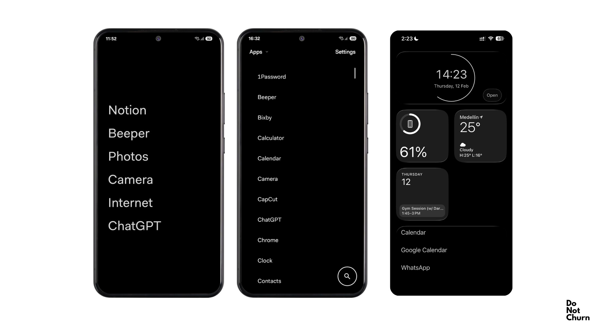
Minimalist Phone is a radical architectural intervention built for people who realize their attention is hijacked before they make a conscious choice. Minimalist Phone nailed that apps are not the problem, but the actual visual interface triggers are.
Job it does:
“My phone is designed to grab my attention constantly. Colorful icons, red notification badges, infinite feeds - I want to use my phone as a tool, not get trapped by it. I need the interface itself to stop triggering me.”
It translates to: Replace icon grid ✔️ > Enable text-based launcher ✔️ > Add grayscale mode ✔️ > Remove visual triggers ✔️ > Reduce cognitive pull ✔️
Best users: • People who compulsively unlock their phone without knowing why
• Those who’ve tried blockers but still get sucked in by the home screen • ADHD users sensitive to visual stimuli • Anyone who wants friction before they open an app, not after
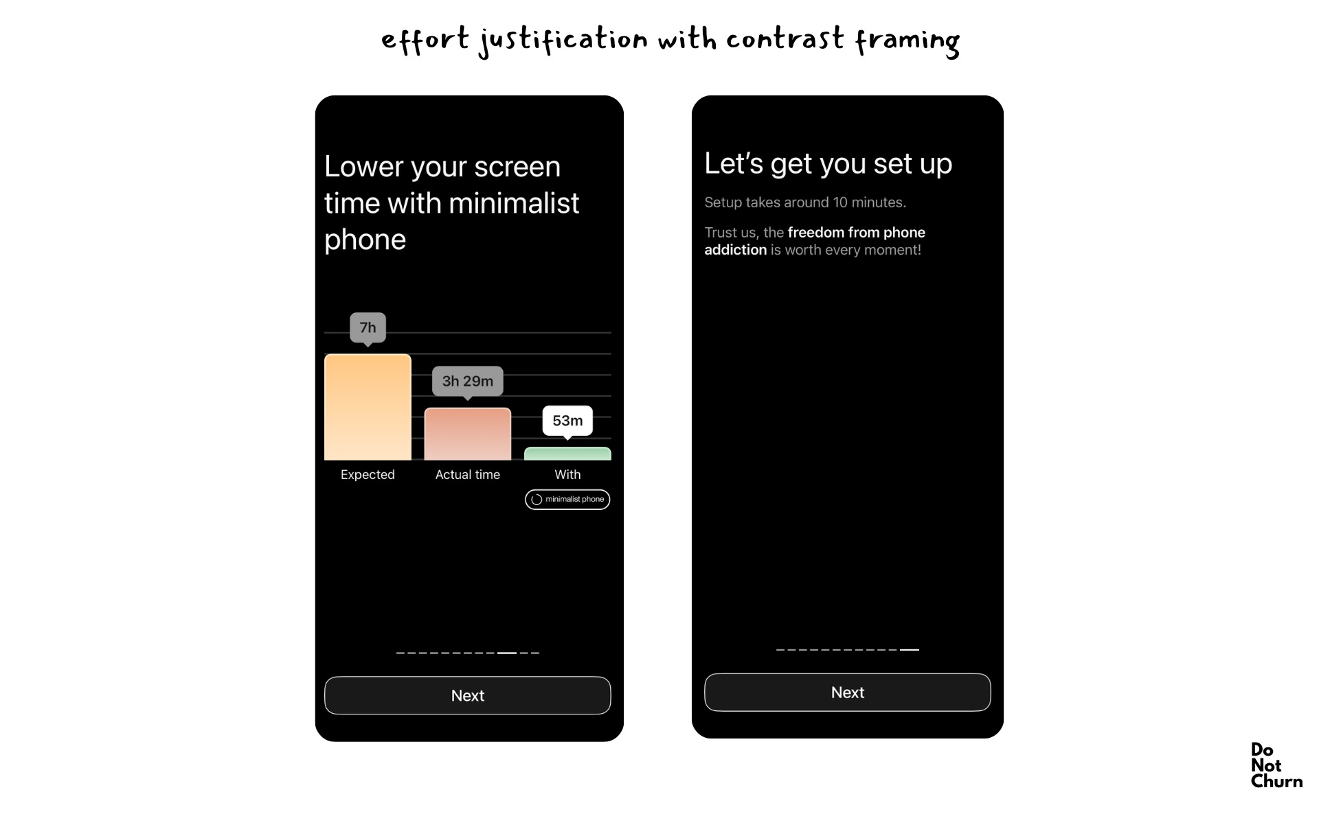
While tools like Opal block apps after you try to open them, Minimalist Phone prevents you from wanting to open them in the first place.
Minimalist Phone has a permanent architectural effect on interface conditioning. That’s why its churn profile looks fundamentally different.
The core insight is neuroscientific: visual pop-out effects in app icons automatically capture attention through the ventral attention network, which operates pre-consciously. Your brain registers the red badge, the bright colours, the spatial memory of “Instagram lives here” before you’ve decided to open anything. By the time conscious choice arrives, you’re already halfway through the unlock-swipe-tap sequence.
Minimalist Phone attacks this at the root. The text-based launcher removes visual salience entirely. Instead of a grid of colourful icons, you see a list of text labels.
The grayscale mode compounds this. Without colour, dopamine prediction errors (the “ooh, something new!” response) are dampened. Your phone becomes a tool, not a stimulus.
Minimalist Phone has clearly nailed prevention-at-interface-level and friction-as-feature.
The retention mechanism is particularly interesting: after 3 days, 93% of users reduce screen time. But more importantly, after 2-3 weeks, returning to a normal launcher feels overwhelming. This creates neural rewiring as a retention moat. Churning from Minimalist Phone means going back to an interface that now feels wrong.
Churn watch:
Where churn can emerge is during the first 72 hours, when the interface still feels unfamiliar and inconvenient.
A key friction point is legitimate use cases for visual interfaces -- maps, photos, and design apps that need colour and visual information. Grayscale mode makes these harder to use, and users can feel penalised for non-problematic phone use.
The strategic insight: The first 72 hours should feel like an upgrade, not a downgrade. If users push through that window, habituation locks them in. Leveraging progressive adoption by starting with the text launcher only, and adding grayscale gradually as the user adapts. Positioning this as “becoming someone who uses their phone consciously” rather than “restricting yourself” will reinforce identity shift.

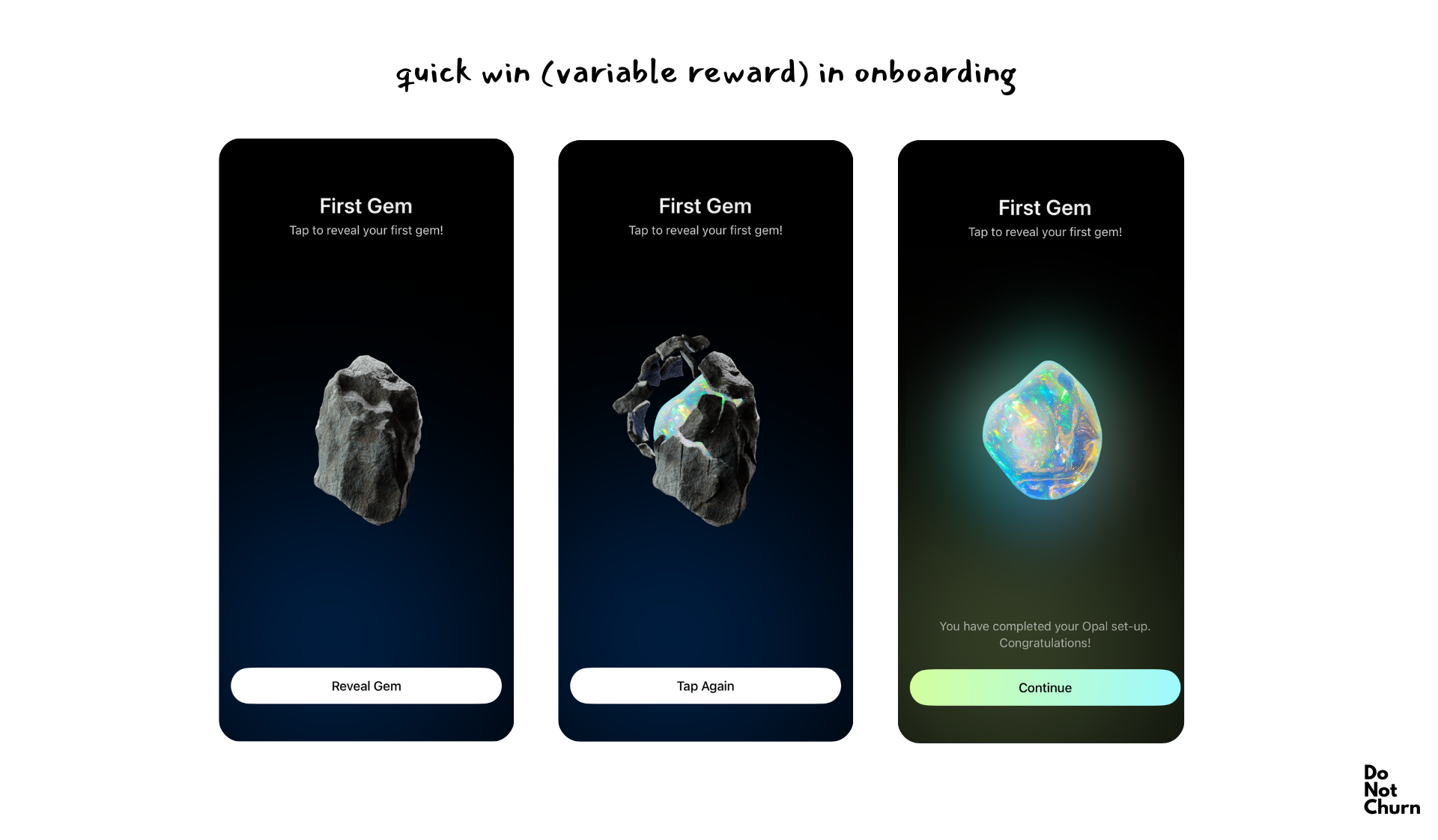
Opal is a hard enforcement tool designed to stop you when self-regulation has already failed. It doesn’t try to support you, it doesn’t try to prevent temptation -- it tries to be stronger than your impulses.
Job it does:
“I know exactly what I shouldn’t be doing -- scrolling TikTok during work, checking Instagram before bed, getting lost in YouTube. I’ve tried willpower, and it doesn’t work. I need something that physically stops me and shows me how bad the problem actually is.”
It translates to: Track all attempts ✔️ > Generate Focus Score ✔️ > Compare to peer benchmarks ✔️ > Create accountability ✔️
Best users: • People who’ve failed with softer interventions • Those who want data on their actual behaviour, not their intended behaviour • Anyone who needs external enforcement because internal discipline is exhausted
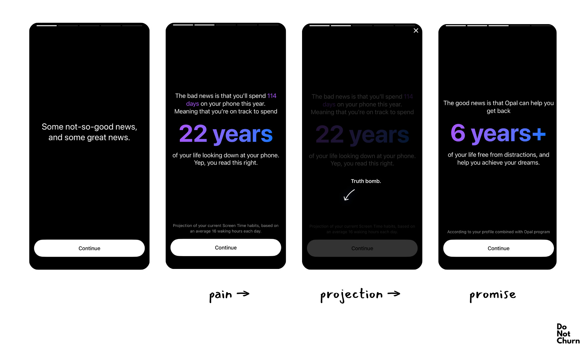
Opal nailed hard enforcement with data-driven accountability -- blocking apps through Screen Time API so there’s no easy override, tracking every unlock and app-opening attempt, and translating behaviour into a Focus Score that users can compare against peers.
This is a behaviourally aligned product.
The strength is in making invisible behaviour visible. Most people underestimate how often they reach for their phone. Opal shows you attempted unlocks, time spent per app, and Focus Score trends over weeks. The leaderboard feature adds social proof: “You’re less distracted than 76% of Opal users” becomes a metric worth protecting.
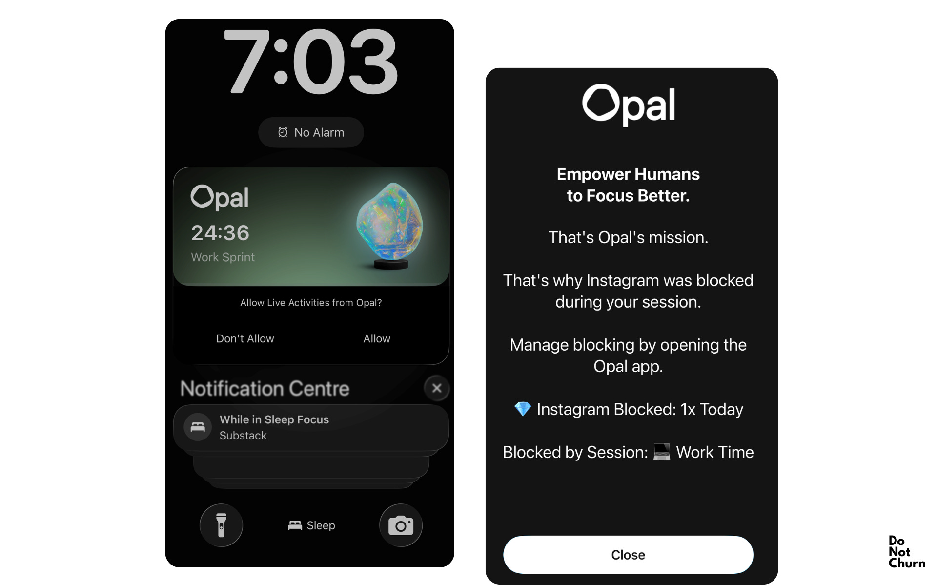
The 430K+ user base creates network effects -- the more people on Opal, the more meaningful peer benchmarking becomes. With a reported 94% reduction in distraction and an estimated $350-450K MRR, Opal has found product-market fit with people who need discipline-as-a-service.
Churn watch:
The churn mechanism is score ceiling and loss of novelty:
Months 1-3: Focus Score improves dramatically (45 → 78), users feel transformed, app feels essential
Months 4-6: Score plateaus (78 → 81), improvements get smaller, dopamine from “getting better” fades
Months 7+: Score stabilises, app becomes invisible infrastructure, users question if they still need it
The paradox: When Opal works perfectly, users feel like they’ve fixed the problem and no longer need help.
Over time, users may feel that it helped them learn discipline, but they’ve internalised it and no longer need external enforcement.
The strategic insight: Opal should behave like a gym membership for attention -- you might not go every day, but canceling it means admitting you’re okay sliding back. Long-term trend insights, “Your focus has improved 34% since January -- here’s what changed,” can surface value beyond daily scores.
The six retention mechanics
1. Baseline shift lock-in
After 2-3 weeks of use, the user’s perception of “normal” fundamentally changes. Minimalist Phone users find colourful launchers overwhelming. Endel users can’t work in silence anymore. The product doesn’t just solve the problem -- it rewires what feels acceptable. Churning means returning to a state that now feels broken.
The goal isn’t to fix the user temporarily -- it’s to make them unable to tolerate unfixed conditions.
2. Data archaeology value
Historical usage data becomes increasingly valuable over time, creating sunk costs. Opal’s 6-month Focus Score trend. Endel’s cumulative hours in flow state. The longer you use it, the more painful it is to lose that history. It’s not just abandoning a tool -- it’s abandoning proof of your progress.
3. Identity formation over behavior modification
Users transition from “I’m trying to use my phone less” to “I’m someone who has a minimalist phone.” From “I’m using Endel to focus” to “I’m an Endel person.” The product becomes part of identity, not a temporary fix. Churning feels like losing part of who you’ve become. Marketing and UX should reinforce the identity language. “Join 430K people taking control” (Opal) works better than “Try blocking apps.”
4. Platform entanglement
Cross-device sync, wearable integration, and ecosystem presence create compounding switching costs. Endel on iPhone + Apple Watch + Mac means churning requires finding three replacements. Opal’s VPN configuration across devices makes switching technically annoying. The more integration points, the higher the exit friction.
Race to occupy multiple surfaces in the user’s tech stack. Calendar integration, desktop apps, browser extensions, smart home integration -- each adds a removal barrier. The question shifts from “Should I keep this?” to “Is it worth the hassle of uninstalling everywhere?”
5. Comparative anxiety retention
Users fear regression more than they value improvement. “What if I go back to 7 hours daily?” becomes a retention moat. The product isn’t just providing value -- it’s preventing feared outcomes. Fear of baseline regression (losing gained ground) is stronger than the desire for marginal improvement. Occasionally remind users of their “before” state. “Remember when you averaged 142 phone unlocks daily? You’re now at 48.” Don’t make it guilt-inducing -- make it empowering proof that regression is possible and they’ve escaped something they don’t want to return to.
6. Gamified progress metrics that create their own goal
Opal’s Focus Score doesn’t measure an external outcome (productivity, deep work completed) - it measures itself. Users arrive wanting to “use their phone less,” but within weeks, the goal shifts to “improve my Focus Score.” The metric becomes the objective, not a proxy for the objective.
This creates a self-perpetuating retention loop: the score only exists within Opal, so maintaining it requires staying subscribed. Unlike external goals (”finish my novel,” “launch the product”), which can be achieved and completed, the Focus Score is infinite -- there’s always room to improve from 78 to 81, to introduce streaks, to beat last month’s average.
Create proprietary metrics that only exist within your product. External goals can be achieved elsewhere; internal scores lock users into your ecosystem. The score should be infinite (no ceiling), comparable (leaderboards), and dynamic (adaptive targets prevent plateau).
Key takeaways
Focus apps compete on primary intervention timing, not feature presence. Products may offer blocking, soundscapes, and analytics -- but the question is “what do users come for?”
Ambient support tools (Endel) succeed through habit formation and passive presence. Retention comes from neural conditioning, not feature depth. The product should become unconscious infrastructure.
Architectural prevention tools (Minimalist Phone) retain users through interface adaptation. After 2-3 weeks, the brain rewires to prefer low-stimulation interfaces. Churning means returning to an environment that now feels overstimulating.
Hard enforcement tools (Opal) face a success paradox: when they work perfectly, users feel they’ve internalised discipline and no longer need help. Retention requires shifting from “improvement score” to “maintained streak” and expanding the enforcement scope beyond the initial use case.
Retention follows primary intent alignment; churn begins when users feel the product solved a problem they no longer have -- even if the problem would return without the product. Products survive by either (a) making their value attribution visible, or (b) becoming so integrated that removal feels like losing a limb.
Written in my head during a 10-hour ascent of Fuego, an active volcano outside Antigua, Guatemala, and written down shortly after.